Thursday, June 12, 2014
Final Portfolio
This portfolio is a compilation of my favortie photographs I have taken and edited throughtout the year. I have learned to use different composition and editing techniques that can bee seen in some of these images. Over the course of the year I think that my photographs have gotten better, and my portraits were some of my favorites.
Thursday, May 29, 2014
Tuesday, May 13, 2014
Project 10 - Magazine Mock-Up
For this project we had to create a mock-magazine, including a cover, one add, one article, and one spread. This is my magazine.


Tuesday, April 22, 2014
Project 9 - Portraits
For this project we shot fine art and commercial portraits, then edited them in Lightroom. These are my edited fine art portraits and my edited commercial portrait that I turned into a magazine cover in Photoshop.
 |
| Reflected Rays |
This fine art photo is of my friend Zoë. I chose to make the image black and white because I liked the way that the light and shadows that the light produces were more pronounced without color. I had her look down when I took this photo so the light would catch on her eyelashes. The pose also gave the photo a melancholy feeling that was further emphasized by the lack of color.
 |
| Two-Faced |
This fine art photo is a portrait of my friend Caroline. I edited this image with sepia tone instead of full color because it enhanced the shadows. I really liked this photo because of the way the light hit her face, and created a two tone mask. On the right side of her face, her dark circles are more evident, and the left side is brightly lit to create a cheery façade. I also liked the additional contrast of the rough concrete behind her and her dressy clothing.
 |
| Illuminated Words |
This fine art portrait is of my friend Anna. I chose to shoot with her in a very relaxed setting. This gave the image a cozier feel that goes along with the emotions she is portraying as the subject. Her relaxed pose and her smile give the image a happier tone. The change from color to black and white increased the focus on the lighting of the photo which I really liked and also added to the bright, cheerful tone.
 |
| Monthly Reads |
This photo is also of my friend Anna, taken in the same setting as the portrait above. I liked that she wasn't looking directly at the camera, which shows her interest in her novel. I thought it would be good to use this interest to draw in an audience to want to read as well; this is why I chose to use it as my magazine cover, and to do a reading magazine. The black and white increases the focus on her as a subject as does the placement of the sidebar words. By making the photo black and white and carrying that theme throughout the cover, I was able to use color to enhance the words on the sidebar that I would want the reader to focus on.
Tuesday, April 15, 2014
Project 9 - Portrait Contact Sheet
For this project we had to take commercial and fine art portraits. I chose the ones that I liked the best and then edited them in Lightroom. These photos, originals and edits, are arranged on my contact sheet.

For my fine art portraits, I think that I will be using the sixth photo in the first row and the second photo in the fourth row. Both of these photos have lighting that creates shadows on the subject's face that I really like. The shapes created by the shadows tell a better story about the subject and the emotion they are portraying. For my commercial portrait, I am thinking of using the third and sixth picture in the fifth row, the second picture in the sixth row, or the the fourth picture in the sixth row. The photos in the fifth row are more commercial, but the lighting in the pictures in the sixth row is more effective. I like the idea of using the pictures in the sixth row as the front of a more thought provoking magazine.
Wednesday, April 2, 2014
Portraits
There is some distinction between fine art portraiture and commercial portraiture, but sometimes it can be hard to find that separation. Fine art portraits are not usually candid or overly bright, and often times photographers will make them look almost surreal. The photographer will usually attempt to have the subject portray some strong emotion. Unlike commercial portraiture, fine art portraits are shot by photographers who are not being hired, which gives them a bit more freedom with their subjects and images. Commercial portraiture, is created by photographers that have been hired and have an assignment. Some commercial portraiture for magazines is very bright, lively, and glamorous, unlike most contemporary or modern fine art portraiture. However, there are some similarities like the posed nature of both types of portraiture. Additionally, some fine art photographers who shoot fine art portraiture also shoot commercial portraiture, usually bringing some of the aspects of fine art photography to the commercial realm. This is why some commercial portraiture looks very much like fine art portraiture, the only differences being that the photographer has been hired and given an assigned task.
Fine Art Portraiture
Fine Art Portraiture
 |
| P.H. Fitzgerald |
This photo stood out to me immediately from P.H. Fitzgerald's photographs because of the soft contrast created by the natural light. The geometrical shape of the window juxtaposed with the softer edges that outline the subject also create an intriguing contrast. I was also drawn to to colors in the image, worn colors, that match the pensiveness that the subject is embodying. The window, shows the outside world, which is much brighter than the inside portion of the setting, yet some of that light comes through the window to create a gradual change from light to dark. I also liked the composition, which placed the subject off-center. Additionally, the way the subject is posed is very effective, allowing the viewer to see her profile backlit by the natural light, which makes the image much more interesting than if she had been looking directly at the lens.
This portrait, like the other fine art portrait that I chose, does not show the subject's entire face, allowing the viewer to focus on other details instead. This creative approach is one I find much more interesting than most portraits that show the subject's entire face; while it does not give the viewer as much information, it allows the viewer to create their own story for the subject and what is hidden by the posing or visual information that has been purposefully left out. The first aspect of this photo that stands out is the subject's eye, and the fact that she is not facing the camera, but looking off at something else. Then, the lighting draws the eye to the subject's freckles, which cover most of her face. The depth of field in this picture also enhance this focus on this portion of the face, right around her eye, while the background is blurred. The focus on this part of the subject's face is also emphasized by the lighting and sepia tone, both of which are very effective.
Commercial Portraiture
This commercial portrait looks very much like a fine art portrait because of the lighting and composition, but there are other aspects that differ from most fine art portraits. The subject is looking directly at the camera, which is not as common for fine art portraiture, and much more frequent in commercial portraits. The layout of the print over the picture is also effective for this commercial portrait because it is very minimal and does not distract from the powerful image. Though there is text overlaid on the image, the viewer is first drawn to the subject's eyes, which are very clear; the image is composed in a way so her eyes are in the center to allow this initial draw.
 |
| Fritz Liedtke |
Commercial Portraiture
 |
| Afghan Girl by Steve McCurry |
 |
| Annie Leibovitz |
This portrait has multiple subjects, which can be common in commercial portraiture, especially for magazines. With multiple subjects, posing is extremely important, and this image shows how it can effect an image to better tell a story. Additionally, the editing done on this image gave all of the colors a similar tone, making the image more cohesive. As for the layout, the text is placed in areas that are open and so not clash with any of the elements of the picture. The use of different fonts and colors for the text also draws the viewer to that information.
 |
| Annie Leibovitz |
This portrait, shot by Annie Leibovitz is a commercial portrait. Leibovitz was hired to take portraits of celebrities portraying Disney characters. Though it is a commercial image, there are many techniques used that are also used on some fine art portraits. The lighting, for example is very effective, as the castle is very lit up, giving it a magical feel and Scarlett Johansson as Cinderella is running from the light into a darker portion of the portrait. This lighting adds to the story told by the image. Also, the expression Johnasson's face and her pose also tell about her character and the feeling she has in that moment: worry and possibly some sadness. However, as a commercial portrait, what drew me to the photo was the fact the text on the photograph is very minimal, allowing the image to speak for itself rather than having to use an immense amount of text to entice the viewer.
Tuesday, March 18, 2014
Project 8 - Multiple Image Techniques
For this project, we used Photoshop to edit our photos using different image techniques. The first technique was multiple exposure. When shooting the photos for this technique, the photographer must take several photos of the same subject, moving around the subject, or having the subject move. This allows each photo to show a different perspective. Once layered in Photoshop, altering the opacity and layer effects gave the final image a motion blur. The second technique was panorama. To create a panorama in Photoshop, the photographer must take several pictures of one space, moving horizontally or vertically. To be able to stitch the photos together in Photoshop, they had to overlap to some extent. This allows Photoshop to find the content that matches the pictures to create a longer image. Another important aspect of shooting for the panorama was keeping all the photos level so Photoshop could match them. To ensure they were all level, I used a tripod when taking my photos. The third technique was high dynamic range (HDR) imaging. High dynamic range is achieved by taking several photos of the same subject, but changing the exposure on each of them. Once merged in Photoshop, this technique creates a sci-fi look, with increased brightness and sharpness.
 |
| Multiple Exposure |
My subject in this photo is a fountain, so I had to move around it to take the individual photos I used in this image. I used a tripod to ensure each of my photos were level as I moved around the fountain. This way, when I layered them in Photoshop the motion blur wasn't too extreme. I wanted this photo to seem as if the fountain was spinning, which would mean limited motion of the subject, and more movement in the background. Changing the image to black and white helped enhanced this. In black and white, the trees in the background blurred together how I wanted. Additionally, the lack of color and white space around the fountain gives the image an eerie tone.
 |
| Panorama |
For my panorama, I took several pictures of the skyline and stitched them together in Photoshop. I used a tripod to make this process easier. With a tripod, the bottom edge of each photo was the same, which, in addition to the overlap of content in the pictures, made it easy for Photoshop to match together the photos and stitch them together. Once stitched together as a singular image, I further edited to make the sky seem purplish-blue. I also decreased the brightness of the elements at the bottom of the photo so all that can be seen against the brightness of the sky is the outline of the trees. This contrast between the darkness of the bottom quarter of the photo and the brightness of the top portion makes the image much more intriguing.
 |
| HDR |
For my HDR image, I took five photos. Two overexposed, two underexposed, and one with normal exposure and merged them in Photoshop. Then, I increased the brightness to enhance the color and sharpened the photo to increase the detailing. This made the image seem like it was a drawing or computer generated-image, but the light that is filtered through the trees make it seem realistic. This balance is something that I tried to achieve by keeping the light very natural, but also maintaining the vibrancy of the trees, leaves, ferns, and ivy that surround the steps, which is where the light is most prominent.
 |
| HDR Original |
Tuesday, March 4, 2014
Project 7 - Alternative Process Through Digital Means
For this project, we used Photoshop to make our pictures look like different types of non-digital photography. I made both a cyanotype and a daguerreotype. Cyanotype is a photographic printing process that results in a blue-cyan print. It is created by using the two chemicals ammonium iron (III) citrate and potassium ferricyanide. Daguerreotype is another printing process in which images are taken with a daguerreotype camera, and are printed on metal plates. This results in a more textured photograph with darker, brown/black hues.
 |
| Original |
 |
| Cyanotype |
 |
| Original |
 |
| Daguerreotype |
Tuesday, February 25, 2014
Project 6 - Surrealism and Photomontage
For this project, we used our own photos in Photoshop to create a photomontage. I experimented by adding several editing layers to the picture and cutting out different aspects from several pictures and placing them on the background. I also added a texture downloaded from the internet, and worked with manipulating it to go better with the content in the montage.
 |
Balanced Façade
|
Tuesday, February 11, 2014
Surrealism
Surrealism is a literary and artistic movement that began in the 1920's that started the creation of art that shows the work of the subconscious and focuses mainly around imagery that contrasts dream-like ideas with those of reality. The subject matter in surrealist art is often very contradictory, or illogical. Though this ideas began in the early 1920's, it quickly spread and grew, becoming a global movement. Surrealism changes appeared around the world in paintings, visual arts, film, music, and even literature. In some cases, From this movement rose several famous surrealist artists including André Breton, Yves Tanguy, Marcel Duchamp, Salvador Dalí, Max Ernst, and René Magritte.
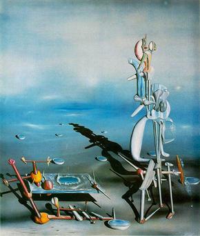 |
| Yves Tanguy |
 |
| Marcel Duchamp |
Tuesday, February 4, 2014
Thursday, January 23, 2014

Tuesday, January 7, 2014
Project 4 - Balance and Contrast
For this project, we took pictures that showed strong contrasts in scale, color or value, and texture, and showed symmetrical balance and radial balance. From my pictures, I selected my favorites to create two diptychs, two triptychs, as well as several kaleidoscopes.
 |
| Scale Contrast Diptych |
 |
| Texture Contrast Diptych |
 |
| Color Contrast Triptych |
 |
| Symmetrical Balance Triptych |
 |
| Burning Leaves |
 |
| Greenhouse |
 |
| Coarse |
 |
| Ornamental Orbs |
 |
| Blue and Purple Vines |
Subscribe to:
Comments (Atom)